> ## Documentation Index
> Fetch the complete documentation index at: https://docs.visibility.so/llms.txt
> Use this file to discover all available pages before exploring further.
# Custom dashboards
> Build a drag-and-drop report from a project's keyword ranking, AI Visibility and organic traffic data, then share it with a client at a public link.
A custom dashboard is a report you compose yourself. You place widgets on a grid, arrange and size them, and either keep the result for your own use or publish it at a public link a client can open without an account. Widgets read the project's [Keyword rankings](/keyword-rankings), [AI Visibility](/ai-visibility) and [Organic traffic](/organic-traffic) data over the last 30 days, so the report stays current without you rebuilding it.
Each dashboard belongs to one project. Any member of the company can create, edit, share and delete a project's dashboards.
## Where to find it
Open a project and choose **Reports → Custom Dashboards** in the sidebar. The page lists every dashboard for the project as a card showing its name, how many widgets it holds and a green **shared** badge when a public link is on.
The **Reports** group, including Custom Dashboards, only appears while the project's **Overview report** feature is on. If you can't see it, turn the feature back on under Project Settings → **Features** (see [Projects](/projects)).
## Create a dashboard
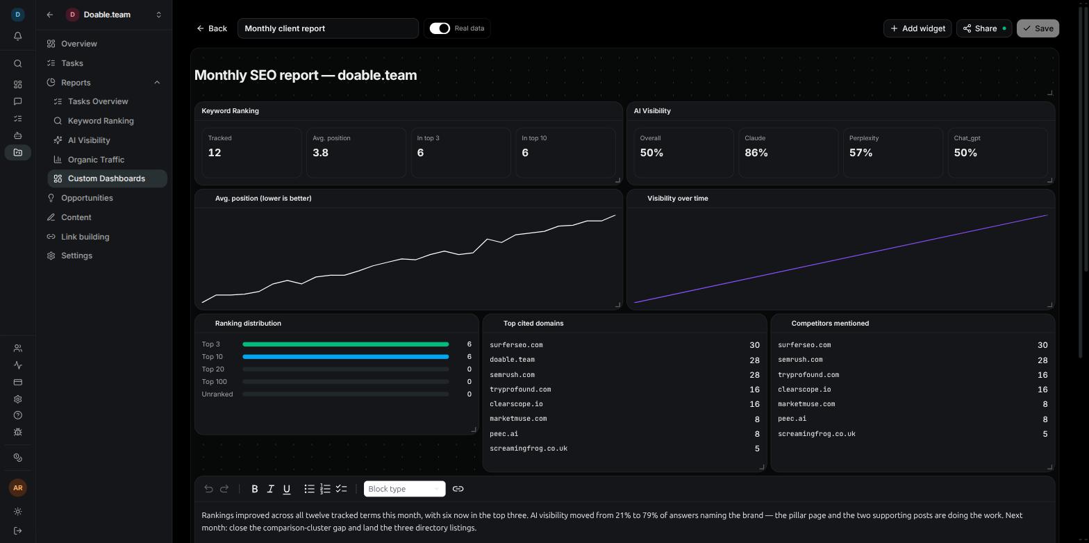
On the **Custom Dashboards** page, click **New dashboard**. Visibility creates an **Untitled dashboard** and opens it in the builder.
Type a name in the toolbar field. Clients see this name at the top of the shared page, so make it descriptive, for example `Monthly SEO report`.
Click **Add widget** and pick a widget from the **Keyword Ranking**, **AI Visibility**, **Organic Traffic** or **Text** group. Each new card lands at the bottom of the canvas and scrolls into view.
Drag cards into place, resize them from the bottom-right corner, and use the gear on a card to set its options. The sections below cover each control.
Click **Save**. The button stays greyed out until something has changed, so if it's disabled your layout is already stored.
 Click **Back** in the toolbar to return to the dashboard list.
## The builder
### Placeholder or real data
New dashboards open with **Placeholder** selected beside the name. In this mode every widget shows clearly labelled sample data, such as `Dummy keyword 1`, and an information notice reading **This is placeholder data** sits under the canvas.
Placeholder data exists so you can design a report before the project has anything to show. A project that was created this morning has no rankings, no AI Visibility checks and perhaps no Google connection yet, but you can still lay out the report you want and save it. As real data arrives, the same layout fills in.
Flip the switch to **Real data** to preview the project's own numbers. The preview covers the same 30-day window the shared page uses, so what you see is what a client will see. The shared link always renders real data, whichever mode the builder is in.
### Add a widget
**Add widget** opens a menu with four groups and 13 widgets. Widget names below are the labels in that menu.
| Group | Widget | What it shows |
| ------------------- | ---------------------------- | -------------------------------------------------------------------------- |
| **Keyword Ranking** | **Keyword KPIs** | Headline keyword-ranking figures for the project. |
| | **Ranking distribution** | How many tracked keywords sit in each ranking band. |
| | **Avg. position trend** | A chart of average position over time (lower is better). |
| | **Top keywords** | A list of the project's best-ranking keywords. |
| **AI Visibility** | **Visibility score** | The project's AI Visibility score per AI assistant. |
| | **Visibility trend** | A chart of visibility over time. |
| | **Brand presence by prompt** | Which tracked prompts mention your brand. |
| | **Top cited domains** | The sources AI assistants cite most often in your prompts. |
| | **Competitors mentioned** | The competitors that appear most often in AI answers. |
| **Organic Traffic** | **Traffic KPIs** | Metric tiles from your connected Google Analytics and Search Console data. |
| | **Traffic trend** | A chart of traffic over time. |
| **Text** | **Heading** | A styled title or section header. |
| | **Text block** | A free-text card for commentary or notes. |
A few cards carry a different title on the canvas from their menu label: **Keyword KPIs** appears as "Keyword Ranking", **Visibility score** as "AI Visibility", **Avg. position trend** as "Avg. position (lower is better)", **Visibility trend** as "Visibility over time", and both **Traffic KPIs** and **Traffic trend** as "Organic Traffic". This page uses the menu labels throughout.
Data widgets only have something to show once the matching feature has data: tracked keywords with at least one refresh for the Keyword Ranking group, at least one completed check for the AI Visibility group, and a Google connection on the project for the Organic Traffic group. Until then, use **Placeholder** to keep designing.
### Arrange widgets
Hover a card to reveal its controls:
* **Move handle** — in the centre of a data card, or in the corner cluster of a Heading or Text block. Drag it to reposition the card. Cards snap to the grid.
* **Resize corner** — bottom-right. Drag it to change the card's width and height.
* **Clone and remove icons** — top-right. Clone copies just that widget, with its options, and places it beside or directly below the original. Remove takes the card off the canvas.
* **Options gear** — top-left, only on widgets that have options (see below).
Widgets are wide by default. If you want two cards side by side, shrink each from its resize corner first, then drag the second one up next to the first.
On a phone the builder is view-only: widgets stack in a single column in reading order, and you can't drag, resize or save a layout. Use a desktop or laptop to arrange a dashboard.
### Widget options
Widgets with a gear icon have settings that are saved with the dashboard. There are three kinds.
**Counts.** A number of rows to show. Each has a minimum and no maximum; if the project has less data than you ask for, the card simply shows fewer rows.
| Widget | Option | Minimum | Default |
| ---------------------------- | ------------------------------ | ------- | ------- |
| **Top keywords** | **Keywords to show** | 3 | 10 |
| **Visibility score** | Providers (assistants) to show | 1 | 3 |
| **Brand presence by prompt** | Prompts to show | 1 | 10 |
| **Top cited domains** | Domains to show | 1 | 8 |
| **Competitors mentioned** | Competitors to show | 1 | 8 |
**Narrow to.** The three trend widgets, **Avg. position trend**, **Visibility trend** and **Traffic trend**, default to the full 30 days. Choose **7d** or **14d** to zoom in on the most recent stretch. A chart can show less than the 30-day report, never more.
**Picks.** A checklist of what to include. At least one item must stay checked.
* **Ranking distribution → Bands to show**: **Top 3**, **Top 10**, **Top 20**, **Top 100**, **Unranked**. All on by default.
* **Traffic KPIs → Tiles to show**: **Sessions**, **Users**, **New users**, **Engagement**, **Bounce rate**, **Avg. time**, **Clicks**, **Impressions**, **CTR**, **Avg. position**. The default set is Sessions, Users, Clicks and Impressions.
### Heading and Text block
The two **Text** widgets let you turn a grid of charts into a report that reads well.
* **Heading** spans the full width by default and is meant for a report title or section divider, such as "Rankings" above the keyword cards. Its style panel offers alignment, italic and serif toggles, a **Size** of **SM**, **MD**, **LG** or **XL**, a **Weight**, a **Colour**, and a **Background** switch that gives the heading a filled band.
* **Text block** is a smaller card for free text: a summary paragraph for the client, notes on what changed this month, or a call to action.
Both are moved from the handle in their corner cluster rather than the centre, so the text itself stays editable.
### Save
**Save** writes the name, layout and every widget's options. It is enabled only while there are unsaved changes. Switching between **Placeholder** and **Real data** is a preview choice and doesn't need saving.
## Duplicate or delete a dashboard
Both actions live on the **Custom Dashboards** list. Hover a card to reveal the icons.
Click the copy icon (**Duplicate this dashboard**). Visibility creates a new dashboard named after the original with "(copy)" added, holding the same widgets and options. The copy is not shared, even if the original is, so you can adapt it for another audience before publishing it.
Click the trash icon, then confirm with **Delete dashboard** in the **Delete this dashboard?** dialog. Deleting a dashboard removes its widgets and immediately disables its public link.
## Share a dashboard with a client
Sharing publishes a read-only copy of the dashboard at a public link. Anyone with the link can open it; no Visibility account is needed.
In the builder, click **Share**. The **Share dashboard** dialog opens.
Switch **Public link** on. A link of the form `https://app.visibility.so/share/dashboard/…` appears with a copy button. The **Share** button in the toolbar now shows a green dot, and the dashboard's card on the list gains the **shared** badge.
Type a password of at least 4 characters into the **Password** box and click **Set**. Visitors must enter it before the dashboard loads. Click **Remove** to clear the password later.
Copy the link and share it with your client. Send the password separately if you set one.
Click **Back** in the toolbar to return to the dashboard list.
## The builder
### Placeholder or real data
New dashboards open with **Placeholder** selected beside the name. In this mode every widget shows clearly labelled sample data, such as `Dummy keyword 1`, and an information notice reading **This is placeholder data** sits under the canvas.
Placeholder data exists so you can design a report before the project has anything to show. A project that was created this morning has no rankings, no AI Visibility checks and perhaps no Google connection yet, but you can still lay out the report you want and save it. As real data arrives, the same layout fills in.
Flip the switch to **Real data** to preview the project's own numbers. The preview covers the same 30-day window the shared page uses, so what you see is what a client will see. The shared link always renders real data, whichever mode the builder is in.
### Add a widget
**Add widget** opens a menu with four groups and 13 widgets. Widget names below are the labels in that menu.
| Group | Widget | What it shows |
| ------------------- | ---------------------------- | -------------------------------------------------------------------------- |
| **Keyword Ranking** | **Keyword KPIs** | Headline keyword-ranking figures for the project. |
| | **Ranking distribution** | How many tracked keywords sit in each ranking band. |
| | **Avg. position trend** | A chart of average position over time (lower is better). |
| | **Top keywords** | A list of the project's best-ranking keywords. |
| **AI Visibility** | **Visibility score** | The project's AI Visibility score per AI assistant. |
| | **Visibility trend** | A chart of visibility over time. |
| | **Brand presence by prompt** | Which tracked prompts mention your brand. |
| | **Top cited domains** | The sources AI assistants cite most often in your prompts. |
| | **Competitors mentioned** | The competitors that appear most often in AI answers. |
| **Organic Traffic** | **Traffic KPIs** | Metric tiles from your connected Google Analytics and Search Console data. |
| | **Traffic trend** | A chart of traffic over time. |
| **Text** | **Heading** | A styled title or section header. |
| | **Text block** | A free-text card for commentary or notes. |
A few cards carry a different title on the canvas from their menu label: **Keyword KPIs** appears as "Keyword Ranking", **Visibility score** as "AI Visibility", **Avg. position trend** as "Avg. position (lower is better)", **Visibility trend** as "Visibility over time", and both **Traffic KPIs** and **Traffic trend** as "Organic Traffic". This page uses the menu labels throughout.
Data widgets only have something to show once the matching feature has data: tracked keywords with at least one refresh for the Keyword Ranking group, at least one completed check for the AI Visibility group, and a Google connection on the project for the Organic Traffic group. Until then, use **Placeholder** to keep designing.
### Arrange widgets
Hover a card to reveal its controls:
* **Move handle** — in the centre of a data card, or in the corner cluster of a Heading or Text block. Drag it to reposition the card. Cards snap to the grid.
* **Resize corner** — bottom-right. Drag it to change the card's width and height.
* **Clone and remove icons** — top-right. Clone copies just that widget, with its options, and places it beside or directly below the original. Remove takes the card off the canvas.
* **Options gear** — top-left, only on widgets that have options (see below).
Widgets are wide by default. If you want two cards side by side, shrink each from its resize corner first, then drag the second one up next to the first.
On a phone the builder is view-only: widgets stack in a single column in reading order, and you can't drag, resize or save a layout. Use a desktop or laptop to arrange a dashboard.
### Widget options
Widgets with a gear icon have settings that are saved with the dashboard. There are three kinds.
**Counts.** A number of rows to show. Each has a minimum and no maximum; if the project has less data than you ask for, the card simply shows fewer rows.
| Widget | Option | Minimum | Default |
| ---------------------------- | ------------------------------ | ------- | ------- |
| **Top keywords** | **Keywords to show** | 3 | 10 |
| **Visibility score** | Providers (assistants) to show | 1 | 3 |
| **Brand presence by prompt** | Prompts to show | 1 | 10 |
| **Top cited domains** | Domains to show | 1 | 8 |
| **Competitors mentioned** | Competitors to show | 1 | 8 |
**Narrow to.** The three trend widgets, **Avg. position trend**, **Visibility trend** and **Traffic trend**, default to the full 30 days. Choose **7d** or **14d** to zoom in on the most recent stretch. A chart can show less than the 30-day report, never more.
**Picks.** A checklist of what to include. At least one item must stay checked.
* **Ranking distribution → Bands to show**: **Top 3**, **Top 10**, **Top 20**, **Top 100**, **Unranked**. All on by default.
* **Traffic KPIs → Tiles to show**: **Sessions**, **Users**, **New users**, **Engagement**, **Bounce rate**, **Avg. time**, **Clicks**, **Impressions**, **CTR**, **Avg. position**. The default set is Sessions, Users, Clicks and Impressions.
### Heading and Text block
The two **Text** widgets let you turn a grid of charts into a report that reads well.
* **Heading** spans the full width by default and is meant for a report title or section divider, such as "Rankings" above the keyword cards. Its style panel offers alignment, italic and serif toggles, a **Size** of **SM**, **MD**, **LG** or **XL**, a **Weight**, a **Colour**, and a **Background** switch that gives the heading a filled band.
* **Text block** is a smaller card for free text: a summary paragraph for the client, notes on what changed this month, or a call to action.
Both are moved from the handle in their corner cluster rather than the centre, so the text itself stays editable.
### Save
**Save** writes the name, layout and every widget's options. It is enabled only while there are unsaved changes. Switching between **Placeholder** and **Real data** is a preview choice and doesn't need saving.
## Duplicate or delete a dashboard
Both actions live on the **Custom Dashboards** list. Hover a card to reveal the icons.
Click the copy icon (**Duplicate this dashboard**). Visibility creates a new dashboard named after the original with "(copy)" added, holding the same widgets and options. The copy is not shared, even if the original is, so you can adapt it for another audience before publishing it.
Click the trash icon, then confirm with **Delete dashboard** in the **Delete this dashboard?** dialog. Deleting a dashboard removes its widgets and immediately disables its public link.
## Share a dashboard with a client
Sharing publishes a read-only copy of the dashboard at a public link. Anyone with the link can open it; no Visibility account is needed.
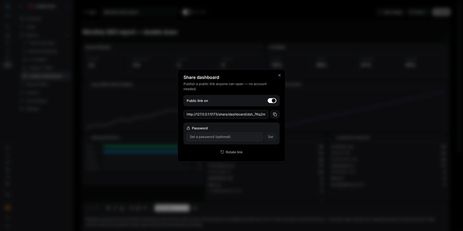
In the builder, click **Share**. The **Share dashboard** dialog opens.
Switch **Public link** on. A link of the form `https://app.visibility.so/share/dashboard/…` appears with a copy button. The **Share** button in the toolbar now shows a green dot, and the dashboard's card on the list gains the **shared** badge.
Type a password of at least 4 characters into the **Password** box and click **Set**. Visitors must enter it before the dashboard loads. Click **Remove** to clear the password later.
Copy the link and share it with your client. Send the password separately if you set one.
 ### What your client sees
The shared page is read-only and always uses real data. It shows:
* the dashboard name and the project name, with the Visibility logo
* every widget, rendered from the project's data for the last 30 days, using the options you saved
* a **Shared via Visibility** footer
On a phone the widgets stack into a single column in reading order.
If the link is password-protected, visitors first see a **Password required** card and click **View dashboard** after entering it. If the link has been switched off, rotated, or mistyped, they see **Link unavailable — This dashboard link is invalid or is no longer being shared.**
**Organic Traffic widgets on a shared link use the Google connection of the person who created the dashboard.** If that person disconnects Google or leaves the company, the **Traffic KPIs** and **Traffic trend** cards on the public page show "Not connected / no data" while everything else keeps working. When a client report depends on traffic widgets, create it from an account whose Google connection will stay in place, or check the shared page after any change to the project's [integrations](/integrations).
### Stop sharing or replace the link
Back in the **Share dashboard** dialog:
* **Rotate link** invalidates the current link and creates a new one. Use it when a link has reached people it shouldn't have; anyone holding the old link sees **Link unavailable** from then on.
* Switch **Public link** off to stop sharing entirely. Your dashboard and its layout are untouched, and you can turn the link back on later.
Deleting the dashboard also takes its link offline.
## Related
Track keywords and refresh positions, the source for the Keyword Ranking widgets.
Run checks across ChatGPT, Claude, Gemini and Perplexity to feed the AI Visibility widgets.
Connect Google Analytics and Search Console for the Organic Traffic widgets.
Turn what the report surfaces into Tasks for your Agents.
### What your client sees
The shared page is read-only and always uses real data. It shows:
* the dashboard name and the project name, with the Visibility logo
* every widget, rendered from the project's data for the last 30 days, using the options you saved
* a **Shared via Visibility** footer
On a phone the widgets stack into a single column in reading order.
If the link is password-protected, visitors first see a **Password required** card and click **View dashboard** after entering it. If the link has been switched off, rotated, or mistyped, they see **Link unavailable — This dashboard link is invalid or is no longer being shared.**
**Organic Traffic widgets on a shared link use the Google connection of the person who created the dashboard.** If that person disconnects Google or leaves the company, the **Traffic KPIs** and **Traffic trend** cards on the public page show "Not connected / no data" while everything else keeps working. When a client report depends on traffic widgets, create it from an account whose Google connection will stay in place, or check the shared page after any change to the project's [integrations](/integrations).
### Stop sharing or replace the link
Back in the **Share dashboard** dialog:
* **Rotate link** invalidates the current link and creates a new one. Use it when a link has reached people it shouldn't have; anyone holding the old link sees **Link unavailable** from then on.
* Switch **Public link** off to stop sharing entirely. Your dashboard and its layout are untouched, and you can turn the link back on later.
Deleting the dashboard also takes its link offline.
## Related
Track keywords and refresh positions, the source for the Keyword Ranking widgets.
Run checks across ChatGPT, Claude, Gemini and Perplexity to feed the AI Visibility widgets.
Connect Google Analytics and Search Console for the Organic Traffic widgets.
Turn what the report surfaces into Tasks for your Agents.